
Scalpo
Brand identity and product design for a trading academy.
The full story in motion — from a blank grid to a complete trading-academy product.
The brief
Scalpo is a trading academy. The brief was simple: make trading feel precise.
An academy teaching institutional-level trading needed an identity and a product that feel calm, exact and premium — rather than loud and speculative.


The mark
The mark is built from geometry — two blades, one rising and one falling: the market in motion. Guides, circles and anchor points keep every angle exact. Finished in warm gold with a custom wordmark.


Brand system
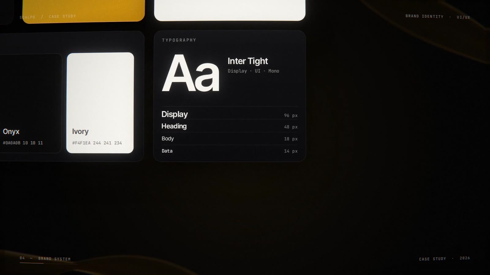
A restrained palette and a confident type system carry the whole brand — one display face for headlines, a clean UI face for product, and a mono face for labels and data.
Clear space is measured from the blade height; the lockup ships in three variations — on onyx, on gold, and mono on ivory.
Touchpoints
Every touchpoint speaks the same language — web banners, social posts, stories and a full app icon family.


From wireframe to interface
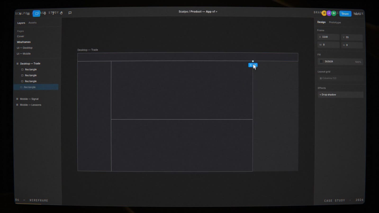
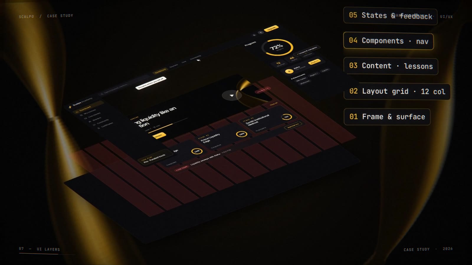
The product started as a wireframe — simple boxes, a 12-column grid and prototype flows — then, layer by layer, became the interface.

Mobile
The same system fits in your pocket — progress, today's lessons, live classes and stage tracking, all on mobile.

Learning experience
Live classes where mentors and students learn together. Courses are mapped into three clear stages — Institutional Edge, Prime Liquidity Edge and Zenith Institutional Method — and a learning assistant answers instantly.


The complete product
From one shape to a complete product.


- ●Logo & Wordmark
- ●Colour & Type System
- ●Logo Variations & Clear Space
- ●Web Banners
- ●Social Posts & Stories
- ●App Icon Set
- ●Wireframes & UX Flows
- ●Desktop Academy Dashboard
- ●Mobile App Screens
- ●Motion Case-Study Film